
How to change the XPages radio button design by CSS
How to apply the CSS design to the radio button in general
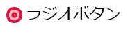
If you want to change the radio button or checkbox design by css, usually you need to prepare the HTML source code like below:
[code lang=”html” highlight=””] <p><input type="radio" id="radio">
<label for="radio">ラジオボタン</label>
</p>
[/code]
The most important point in above HTML is having the “input” and “label” tag as sibling hierarchy. Based on this html, CSS should be specified as following:
[code lang=”css” highlight=””] input[type="radio"]{opacity: 0;
}
[/code]
First of all, hiding the original radio design by setting opacity 0.
In the next step, you can design the button as you like by using label tag like below.
display: inline-block;
content: "";
background-color: lightpink;
color: crimson;
border-style: solid;
border-width: 0.1875em;
width: 0.625em;
height: 0.625em;
margin-top: 0.25em;
margin-right: 0.25em;
border-radius: 0.5em;
}
input[type="radio"]:checked+label:before{
border-style: double;
border-width: 0.5em;
width: 0;
height: 0;
}
[/code]
The css above is the one example of customizing the radio button. The HTML and CSS would be like the image below:
The imporatnt point of this CSS is the selector of ”input[type=”radio”]+label:before”.
The “+label” means to specify the label tag which is sibling of selected input tag (type is radio). By doing this, customizing the design of selected button.
You might wonder why you need to use label tag instead of using input tag directly. The reason why doing this is because input tag cannot use “:before” and input tag itself needs to be hidden. Therefore label tag is needed to customize the design for radio butto/checkbox.
Actually the explanation above is nothing related with XPages. So you will be able to find many design example if you google for the radio button design.
Now I would like to write the article for how to change the XPages radio button design by using only CSS.
Understand the HTML hierarchy of XPages radio button (radio button group)
To apply the similar design to the XPages radio button, first of all, we need to understand the HTML source code which XPages generates for radio button or radio button group control.
Below example is for radio button group control.
<xp:selectItem itemLabel="Radio A" itemValue="A"></xp:selectItem>
<xp:selectItem itemLabel="Radio B" itemValue="B"></xp:selectItem>
</xp:radioGroup>
[/code]
Then, HTML source code is like below. (Domino 9.0.1)
[code lang=”html” highlight=”5,8,11,14″] <fieldset id="view:_id1:radioGroup1" class="xspRadioButton"><table role="presentation" class="xspRadioButton">
<tr>
<td>
<label for="view:_id1:radioGroup1:0">
<input type="radio" id="view:_id1:radioGroup1:0" name="view:_id1:radioGroup1" value="A">
Radio A
</label>
</td>
<td>
<label for="view:_id1:radioGroup1:1">
<input type="radio" id="view:_id1:radioGroup1:1" name="view:_id1:radioGroup1" value="B">
Radio B
</label>
</td>
</tr>
</table>
</fieldset>
[/code]
As you can see, label tag has the input tag as a child. In fact, this html structure makes much harder to customize the design for radio button / checkbox.
No way to inform the checked status of radio button to the label tag
In the first example of CSS above, there is selector of “input[type=”radio”]:checked+label:before”. This means “when radio button has been checked, change the sibling label design!”. However as the XPages’ HTML structure, you cannot use the selector like first example because generally CSS cannot specify the PARENT element by CHILD element status. ( in this case, input:checked cannot inform the status to the label tag)
(It is actually possible if you use the Javascript like jQuery though…)
Never give up! Applying the design only by CSS!
As I explained, XPages cannot use the example CSS above. So I needed to find the other way to apply the custom design.
Using “box-shadow”
After spending a lot of try and error, the CSS for XPages radio button control became like below:
[code lang=”css” highlight=””] fieldset table td label{cursor : pointer;
position : relative;
padding-left : 5px;
margin-right : 20px;
overflow : hidden;
height : 20px;
padding-left : 22px;
padding-top : 8px;
display : inline-block;
}
fieldset table td label:before {
position : absolute;
width : 15px;
height : 15px;
border : 2px solid lightpink;
border-radius : 50%;
left : 0px;
top : 4px;
content : ”;
z-index : 3;
}
fieldset table td label:after {
content : ”;
position : absolute;
width : 11px;
height : 11px;
border-radius : 100%;
left : 4px;
top : 8px;
background-color : crimson;
z-index : 1;
}
fieldset table td label input[type="radio"] {
-moz-appearance: none;
-webkit-appearance: none;
position : absolute;
z-index : 2;
width : 20px;
height : 20px;
left : -23px;
top : 1px;
margin : 0px;
box-shadow : 20px -1px #fff;
}
fieldset table td label input[type="radio"]:checked {
box-shadow : none;
}
fieldset table td label input[type="radio"]:focus {
opacity : 0.2;
box-shadow : 20px -1px #fff;
}
[/code]
In this CSS, “label:before” specifies the outline of radio button, and “label:after” specifies the checked radio design. The point of this CSS is masking the checked radio design by using “box-shadow” for checked and unchecked status.
I know this CSS is more complicated. However you don’t need to apply any javascript or any other html attribute value, and control 100% by just using CSS.
By the way, this CSS does not work on IE8 or less since “box-shadow” is part of CSS3 and IE8 does not support it.
Deep dive more
For more advanced CSS style, for example, you can use the image for radio button design.
The XPages source code below applies the three different type of images and express checked status by using opacity.
<xp:view xmlns:xp="http://www.ibm.com/xsp/core">
<style>
fieldset {border:none;}
fieldset table{
border:none;
width:30%;
padding:10px;
}
fieldset table td {width:50px;}
fieldset table td label{
position : relative;
width : 30px;
height : 30px;
overflow : hidden;
cursor : pointer;
}
fieldset table td label:before {
content : ”;
display : block;
width : 30px;
height : 30px;
border-radius : 100%;
position : absolute;
z-index : 1;
}
fieldset table td:nth-child(1) label:before{background:url(./yes.png)
no-repeat;}
fieldset table td:nth-child(2) label:before{background:url(./no.png)
no-repeat;}
fieldset table td:nth-child(3) label:before{background:url(./maybe.png)
no-repeat;}
fieldset table td label input[type="radio"] {
-moz-appearance: none;
-webkit-appearance: none;
margin : 0px;
position : absolute;
z-index : 2;
left : -30px;
width : 0px;
height : 0px;
display : block;
box-shadow : 30px 0px 0 30px #fff;
opacity : 0.7;
}
fieldset table td label input[type="radio"]:checked {
box-shadow : none;
opacity : 1;
}
fieldset table td label input[type="radio"]:focus {
opacity : 0.0;
}
fieldset table td label input[type="radio"]:hover {
box-shadow : 30px 0px 0 30px #fff;
opacity : 0.5;
}
</style>
<xp:radioGroup id="yesno">
<xp:selectItem itemLabel="" itemValue="1">
</xp:selectItem>
<xp:selectItem itemLabel="" itemValue="0">
</xp:selectItem>
<xp:selectItem itemLabel="" itemValue="2">
</xp:selectItem>
</xp:radioGroup>
</xp:view>
[/code]
The image below is the result. When you click the icon image, the image color is displayed clearly and unchecked radio image turns to subtle color.


